News + Insight
16 October 2023
Creating inclusive spaces through accessible principles
The built environment must be designed to embrace the full breadth of human ability. As creators of great spaces, we listen to our users, understand their needs, and strive to meet those needs in as many was as we can. In this article, Sarah Owen, Senior Design Manager and Strategy lead at Holmes Wood, discusses how to create inclusive spaces through understanding and applying accessible principles.
At Holmes Wood, we strive to create environments that are inclusive and enjoyable to use. We believe the built environment should be designed to embrace the full breadth of human ability.
As we understand more about how people interpret the space around them, we can look to design it in a way that meets their needs. No two people will experience a space in the same way and every person’s experience will be informed by their own ability and their unique needs.
It is our belief that wayfinding is one element of the built environment that can be used to enhance the experience of a space in a positive way for every individual.
What are the accessible principles Holmes Wood uses to create inclusive spaces?
Our aim is always to create spaces that everyone can experience and enjoy together. Making a space accessible for one user group with specific needs will also open that space to others with different, but related needs. For example, designing and identifying a step-free route for users with restricted mobility opens that space to people with more situational access needs such as parents with a pushchair or a person temporarily using walking aids.
The Holmes Wood approach centres on the fact that the principles of every good wayfinding scheme are also the building blocks for accessible wayfinding design. Our project with National Portrait Gallery illustrates this as the nature of the historic building means that the step-free route is neither direct nor obvious. Therefore, our wayfinding scheme needed to direct to the step-free routes and explain how the step-free access points link together across the building.
What are some of the elements you might consider when designing an inclusive wayfinding scheme?
Choice of typography
Typefaces should be chosen for their legibility. Large counters and open apertures can assist with identifying the shapes of letters. The terminals and shapes of letters can also help users to recognise words and increase readability.
Colour contrast
Colours can be selected that contrast with both the physical environment and between the sign material and the content. The contrast value must always be a minimum of 70% to ensure that the content is visible.
The Box Plymouth is a great example of this as the colour palette selected contrasts with the colours and materials found within the building. The use of fret cut letters and pictograms enables visitors to see the heritage surfaces behind and the open spaces beyond.
Universal pictograms
Pictograms can be used to identify facilities pictorially where the user can’t read text or where text is in a language the users cannot understand. Our project at Schwarzman Centre for the Humanities demonstrates this principle by using pictograms to identify facilities, lifts, and stairs without the need for accompanying text.
Reading distances
Sign size, text size and sign position should be large enough for people to read the information relative to where they are positioned when reading the sign. For example, when applied to a wayfinding totem, the largest text should be positioned at the top of the totem for long range visibility and identification. Directional information would be above head height and at a size that can be read from distance. Detailed information would be delivered at a smaller scale closer to the user, who would need to be closer to the totem to read and understand the information.
Optimum viewing height
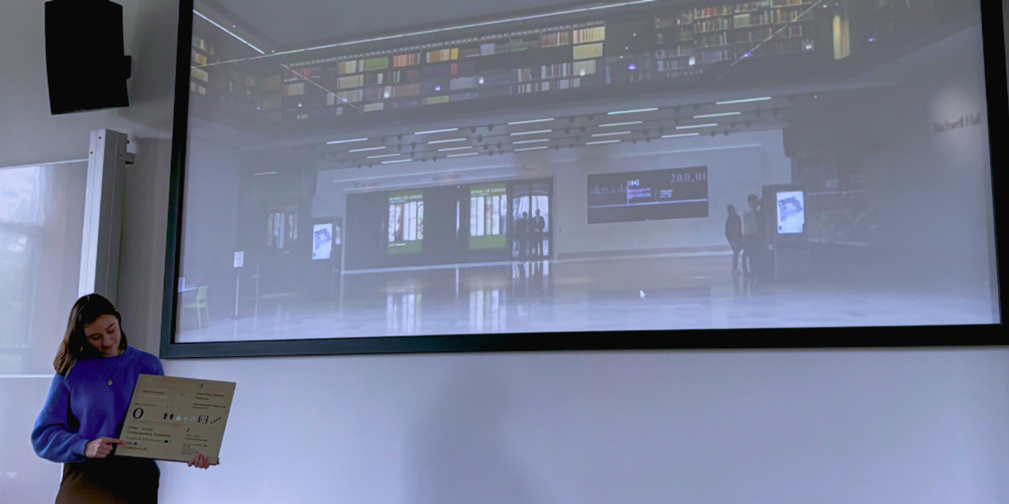
Signs must be positioned at the correct heights for users in both a seated and standing position to read. Screens that have an interactive aspect or are touch activated, must be positioned at a height that users can touch the interactive elements without obstructions, whether they are seated or standing. Our interactive touchscreen maps at Battersea Power Station provided flexible navigational information for all users and can also identify step-free routes if required.
Use of plain language
Language should be simple and clearly describe the function of the space. Content should be curated so it is not overly long. Words should be set in sentence case, using a combination of upper and lower case letters, to help with word recognition, and all caps typesetting should be avoided. For directional signage, the number of destinations per direction should be kept to a minimum as human comprehension is limited to no more than 4-6 messages at a time.
Tactility
Use of tactile content can assist users with reduced vision. This can include, but not be limited to, the use of braille, tactile mapping, and embossed text to create a relief that can be read and understood by touch. Tactile content should be positioned at a consistent height where it can be accessed without obstructions.
Materiality
Use of shiny, reflective materials should be avoided as these can create visual effects that are difficult for some users. Care should also be taken with the use of repetitive patterns in bright or contrasting colours or patterns positioned adjacent to each other, as these can also create unwanted visual effects.
Personalised information
The growth of technology has seen personalised information being pushed directly to users via their mobile phones. Spoken instructions, augmented reality routing and maps downloaded directly to devices can all be used to deliver information in a variety of ways. This approach ensures users have multiple options plus access to alternative routes that meet their needs. The move to mobile phone use for navigation now enables the user to adjust the settings to suit their own personal requirements, offering a wide range of benefits to a much broader audience than ever before and putting more emphasis on the requirement to integrate physical and digital wayfinding.
As we gain an understanding of how people interpret a space, the guidance on how spaces should be designed and the tools we can use are changing. As creators of great spaces, we are always open to listening to our users, understanding their needs, and trying to meet those needs in as many was as we can.
If you would like to learn more about our approach to accessibility principles, please contact Sarah Owen, sarah.owen@holmes-wood.com.
Sarah Owen
Sarah Owen has been working at Holmes Wood for three years. In this time, she has worked on Battersea Power Station, National Portrait Gallery and Schwarzman Centre for the Humanities. She is passionate about enhancing user experience of the built environment by making complex spaces easy and enjoyable to use.