Oxford Brookes University
Unifying disparate spaces with colour and character
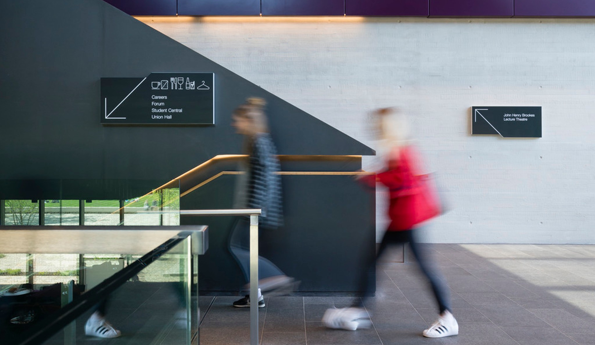
A joyful wayfinding scheme that brings cohesion and connection to an extensive university campus.
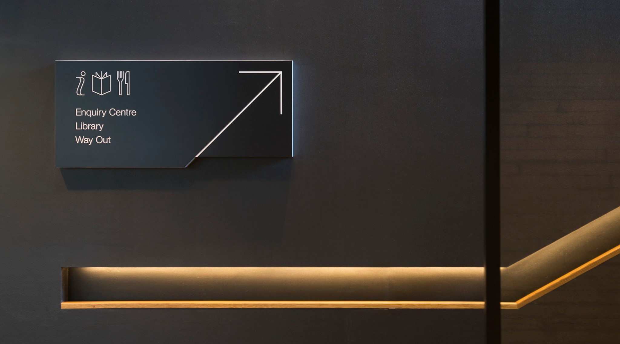
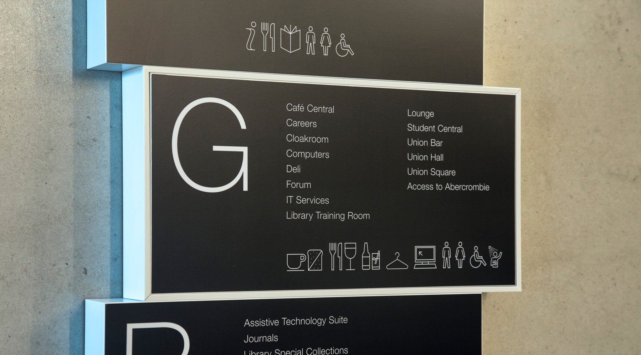
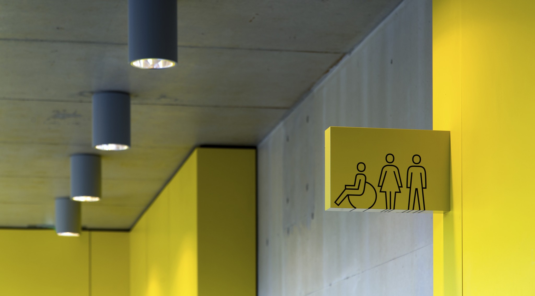
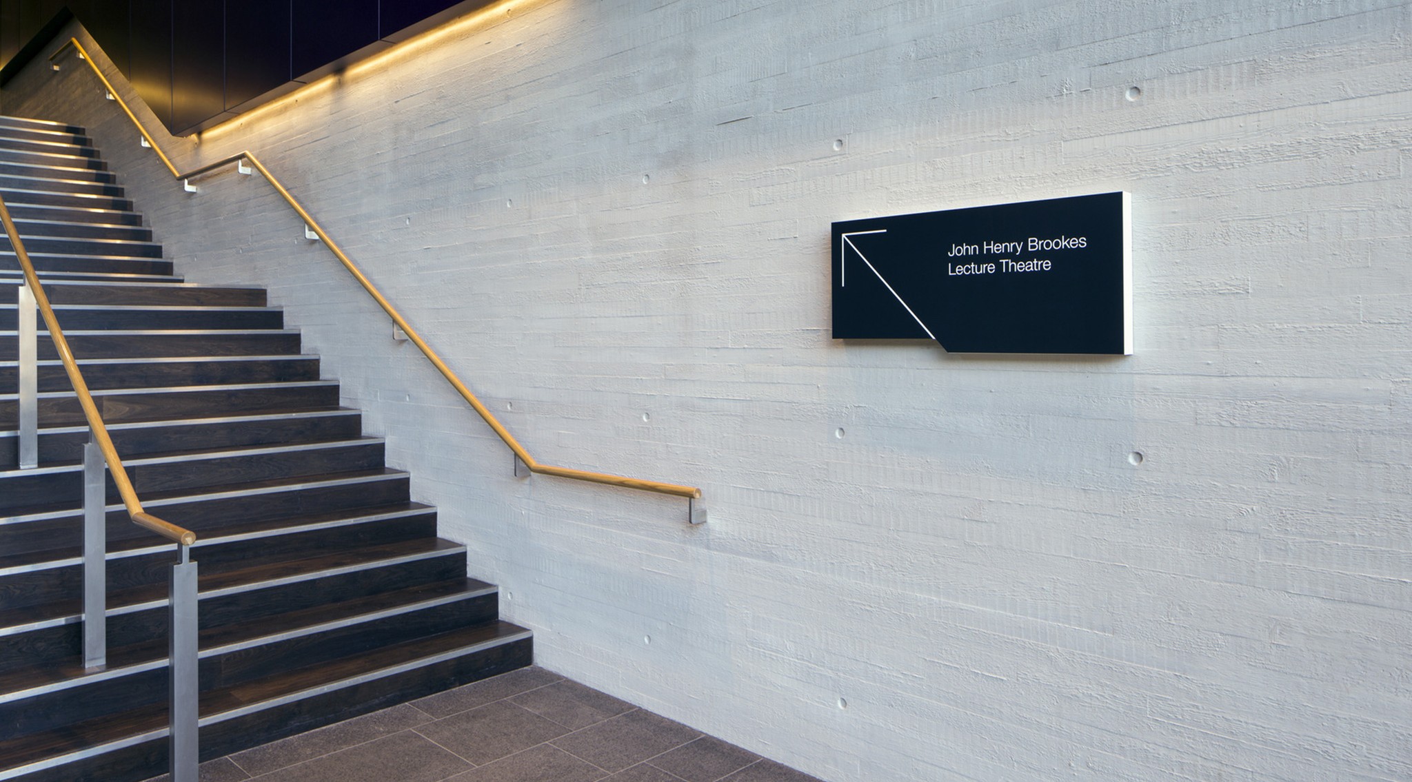
The John Henry Brookes building at Oxford Brookes University needed a new wayfinding scheme to bring cohesion to a disparate campus. The new designs also had to support the integration of older buildings with new student facilities. Our wayfinding solution references the building’s architectural scheme and information graphics. It uses bespoke picograms to bring character and personality to the sign system and complement the University font, Helvetica. The combination of graphics and text, together with bold use of colour, reinforces the co-existence of academic and social areas, helping to achieve cohesion of space and experience. An elegant and effective wayfinding scheme that resonates with a range of people with diverse needs and perspectives.
Client: Oxford Brookes University, UK
Architect: Design Engine
Awards: Silver IIID Award for Wayshowing; SEGD Honour Award for Wayfinding
