Hammerson
Combining stylistic consistency with local flexibility

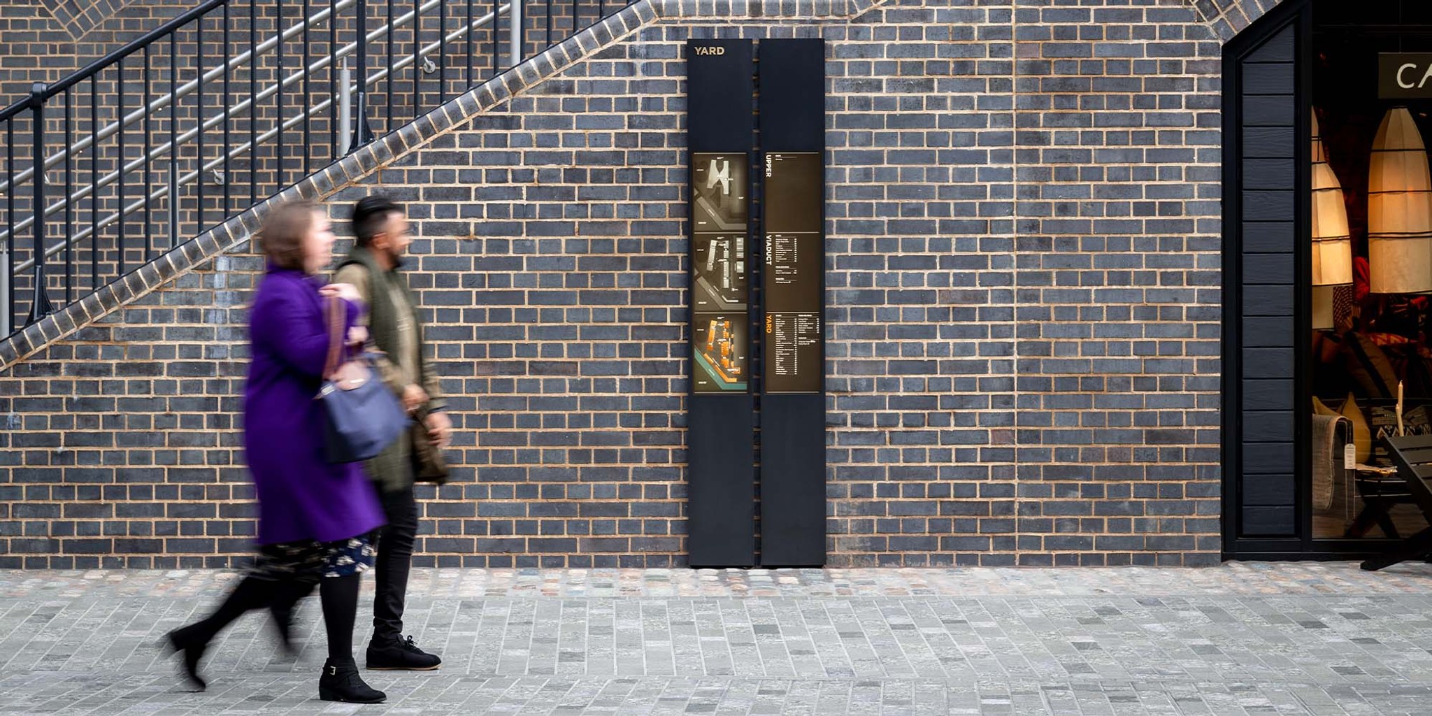
A dynamic wayfinding scheme that unites interior spaces across a leading UK retail portfolio while responding to site-specific context and features.
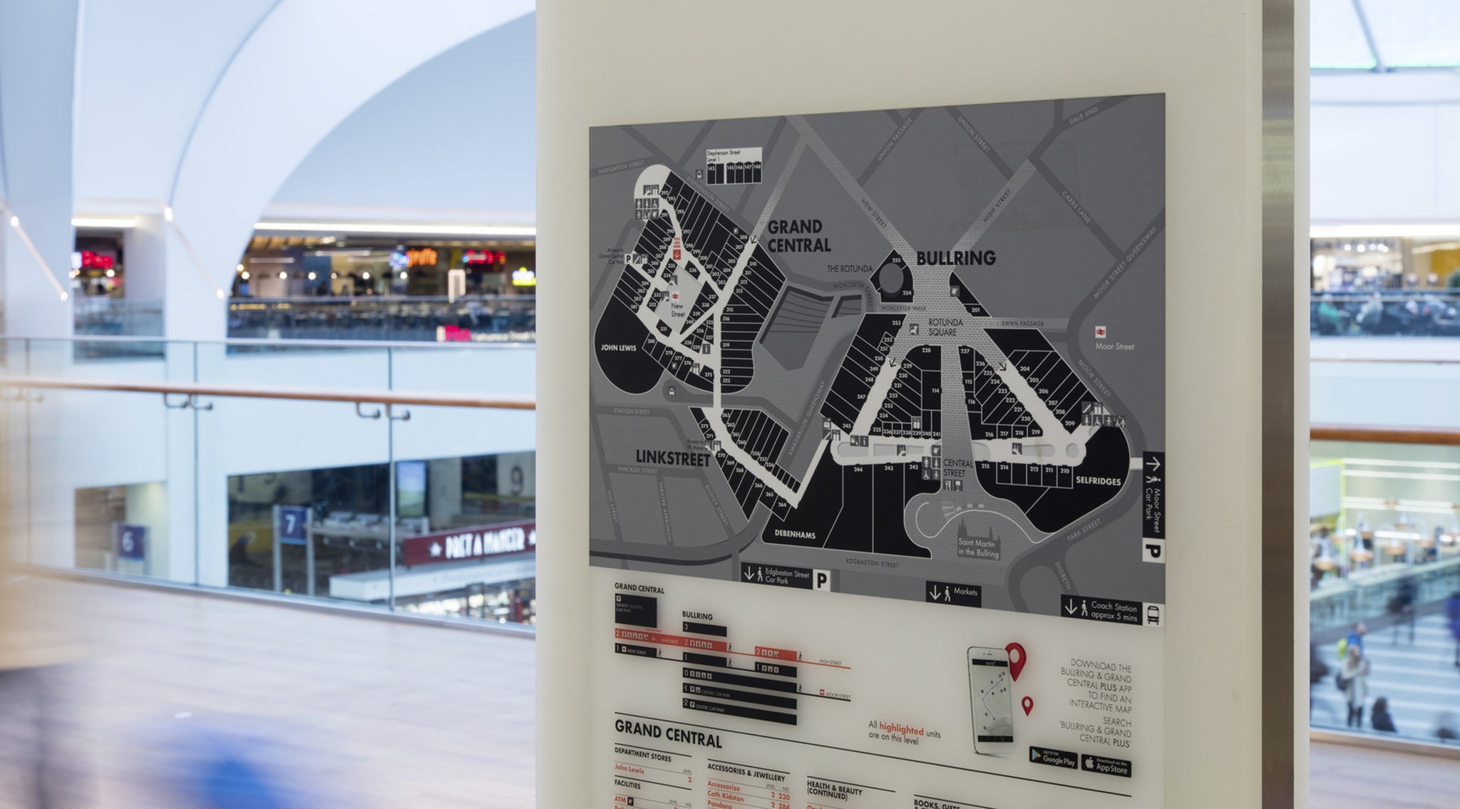
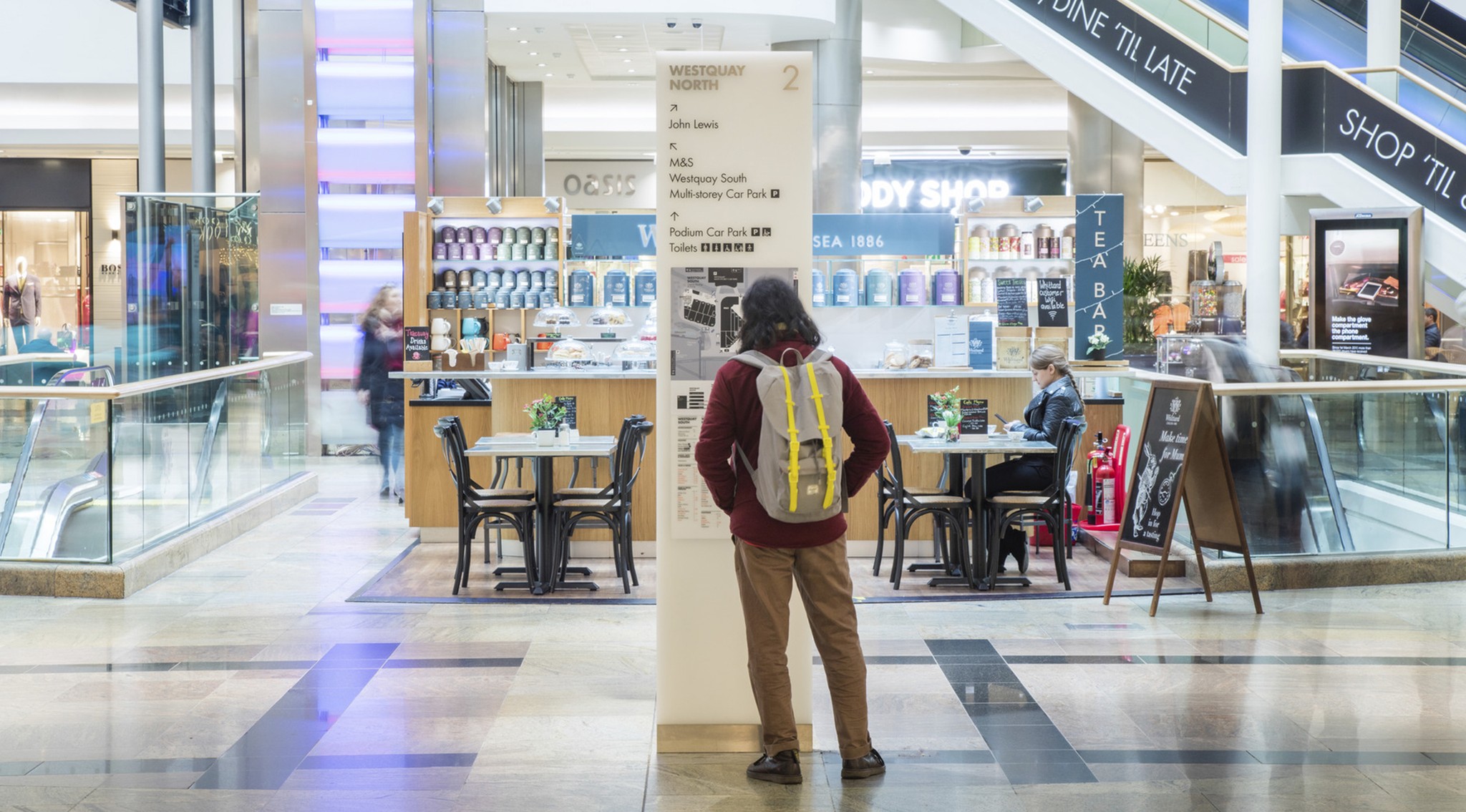
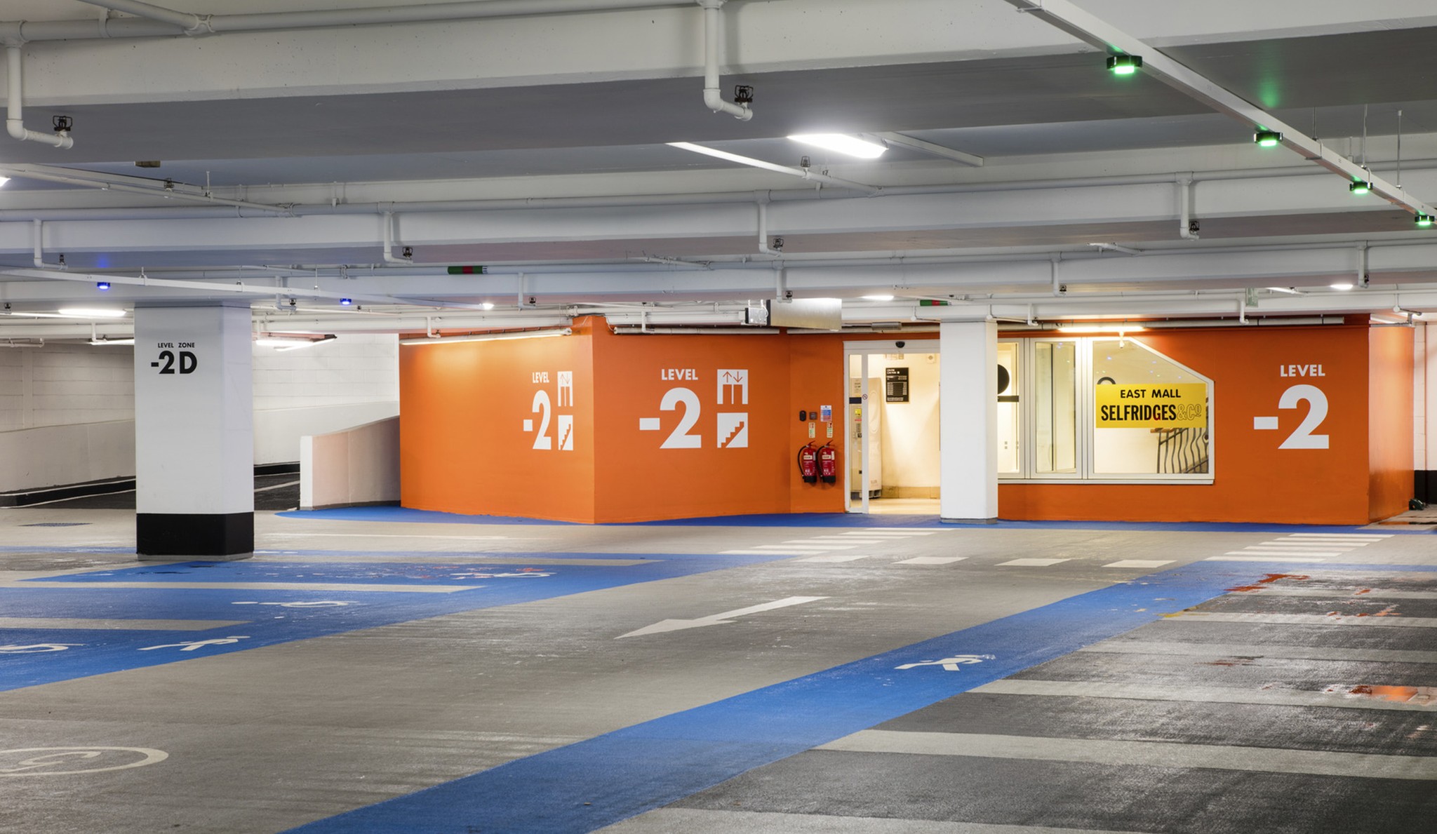
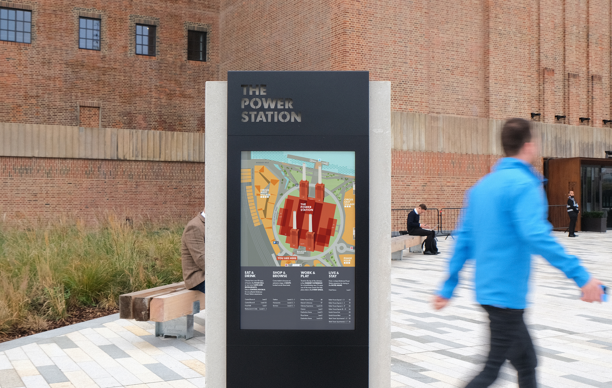
Following a major rebrand, Hammerson required a new brand implementation and wayfinding scheme to be rolled out across its entire UK portfolio. The scheme had to align with the new brand principles, nomenclature and tone of voice and help improve overall customer experience. Our approach was to create a flexible design that could respond to the individual context and character of each site. Accommodating the functional needs of architecture and end-user, the design is intentionally neutral, sitting comfortably with tenants and anchor stores. We also developed a suite of information graphics and pictograms that respond uniquely to the Hammerson brand, while our ‘map concept’ provides stylistic consistency across the portfolio.
Client: Hammerson Group Management Ltd