Paddington Square Cycle Store
Placemaking through use of colour and supergraphics
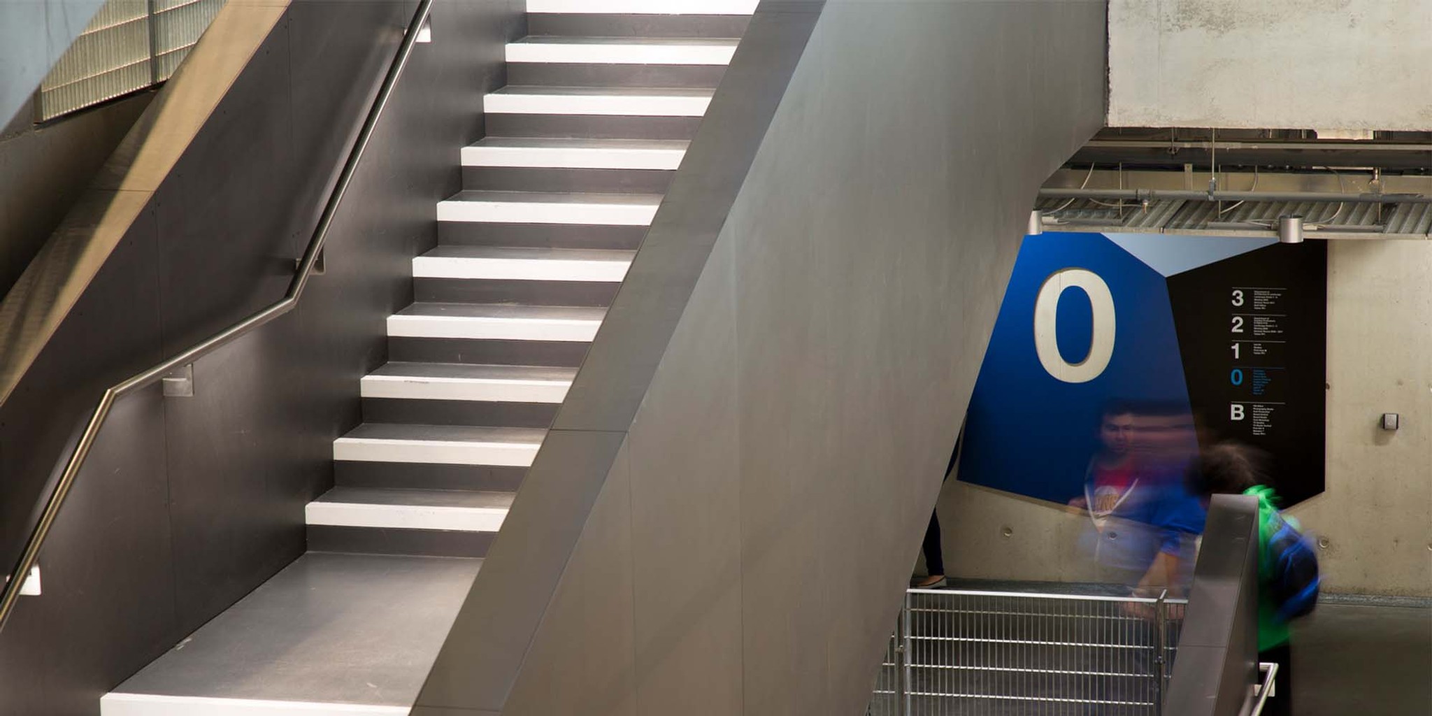
A robust wayfinding strategy that had to flex around shifting building parameters while maintaining visual impact.
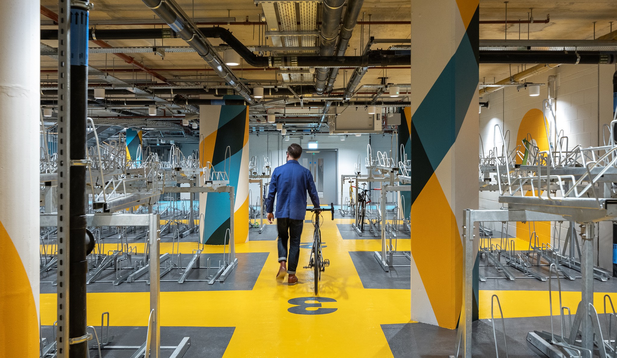
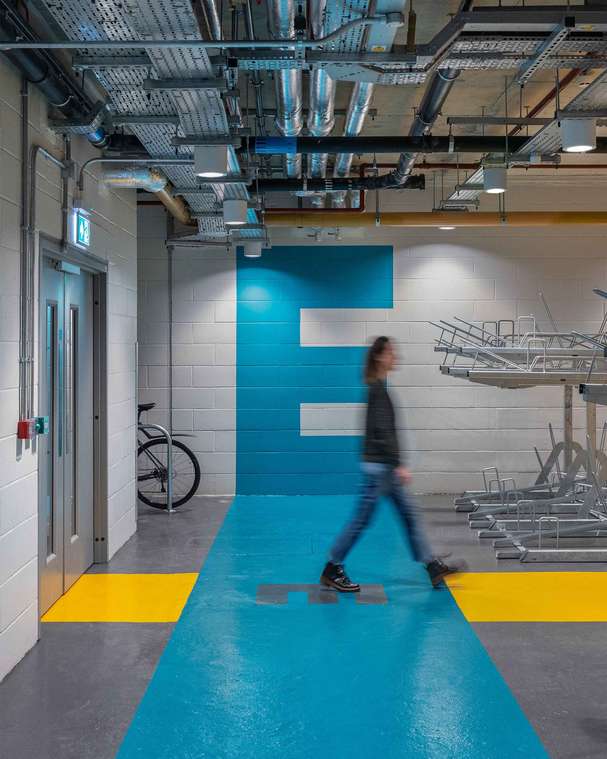
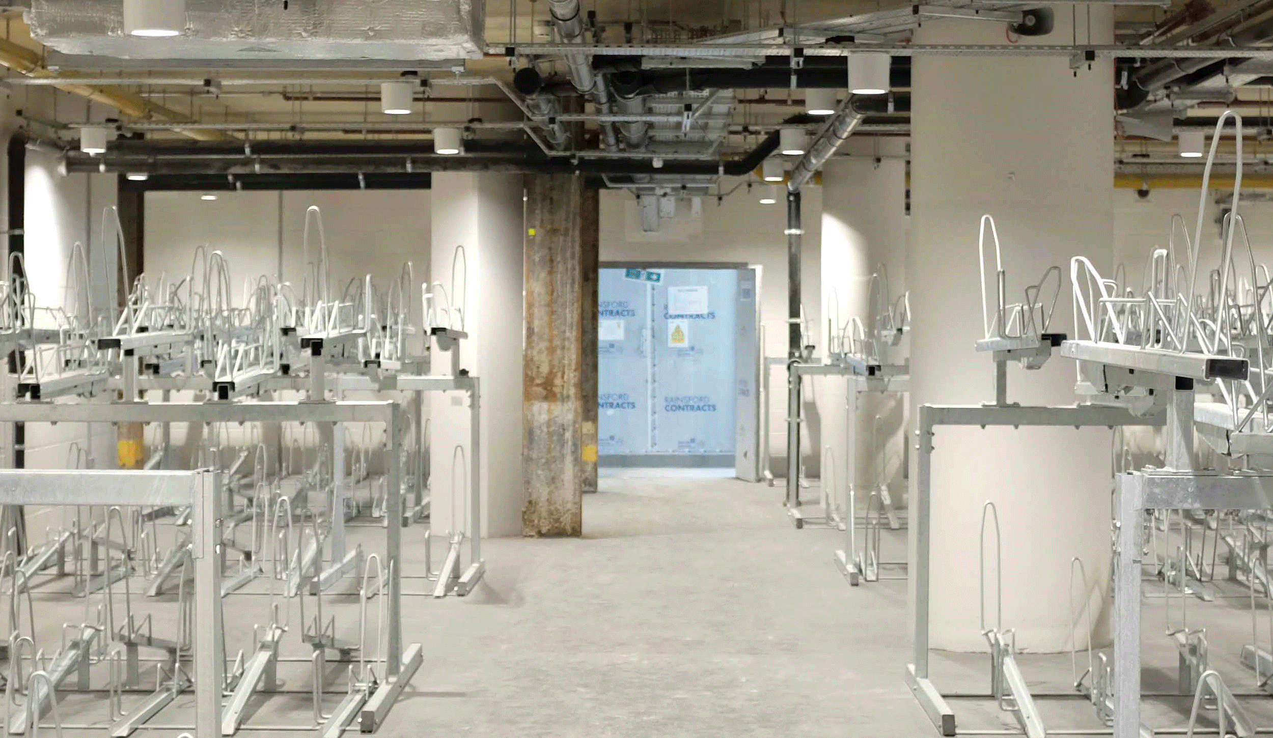
Our original wayfinding designs for the Paddington Square Cycle Store involved working with a blank canvas across all four walls of the new building. But the installation of multiple double-story bike racks required a major rethink. Our revised designs worked around the mounted racks, utilising the available wall space, pillars and floor. To maintain visual impact, we retained the bright colour palette to counteract the lack of natural light. Our use of prominent yellow and orange creates a bright, warm environment, while a ‘hazard tape’ effect on the pillars chimes with the overall urban aesthetic. We also developed new supergraphics to connect the large wall numerals and entrances, using colour walkways to guide users through the space. A classic example of problem solving through wayfinding.
Client: Sellar
Architect: Renzo Piano Building Workshop
Painters: Lucas UK